Friday, December 23, 2016

Mood + Catch Up


... this is what it feels like when you've been trying to repair an old MOV file, but you end up getting nothing back.

I've been trying to apply for two internships but never got around to it due to school. Now that I have the time to finish it, I realized that one of the first animations I worked on has a file damage. Even though it wasn't the best, it would be nice to keep a file of it. However, it's still on my Tumblr and you can view it here (although the sound still doesn't work).


But with school out of the way, I haven't been able to post anything in my typography class. Although this class has challenged me a lot with using type as a design and as the communicator to the audience, I really enjoyed being in this class. It's helped me broaden my vision of design and made me realize how important the text is in a poster, brochure, or even a wordmark. Above is a poster project we did, where we choose a font and have to create an interesting title and a poster that relates to its title.

The font I chose was Univers by Adrian Frutiger. I came up with the title "Parallel Connections" after researching how Frutiger was trying to find "mathematical connections between boldness and width" (Heidrun Osterer & Philipp Stamm, Adrian Frutiger – Typefaces: The Complete Works). With Univers having a uniform look, I was looking up other ways of saying "uniform", where I came upon the word "parallel," meaning "having the same direction; similar" (Dictionary.com). Also knowing that parallel means that there is no intersection, that was when I thought it would be interesting in having the word "connections" part of it—which concluded my title. As for the design, I knew I wanted to have "parallel" and "connections" connect, and later my instructor suggested what if I started to play with the lines from "parallel," which concluded my final poster.


These last images are my final project designs, making a brochure, poster, banner, a website, and applications for AIA's Architecture and the City Festival. The challenge I had was trying to figure out some design with typography with such a long title. After doing some research on this festival, and looking up some pictures of buildings, I was inspired by the Eiffel Tower. The fact that it is a structure, the simple lines and the outlines of the letters displays a nonbuilding structure. Lastly, we were also to create an animation for the text, which I was pretty stoked about.


Saturday, November 19, 2016

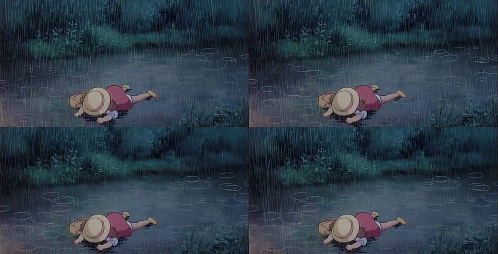
It was a rainy day when I stumbled upon Borrowed Time


I finally got to watch this short film by Andrew Coats and Lou Hamou-Lhadj, two Pixar animators who wanted to challenge animation is not a genre, but a medium that can do any genre. Very touching in a dark way (I cried), but I enjoyed it! I remember Ollie Johnston, one of Disney's Nine Old Men, said "Don't animate drawings, animate feelings!" After watching this film, I definitely feel like everyone who worked on this film executed that so well. Though it is a more mature film, you can still see some qualities that make it Pixar.

For more info about the film, check out the website: http://borrowedtimeshort.com/

Friday, November 11, 2016

4:35am Found Type Drawings

I know it's been a while since I lasted posted. School has gotten crazy the past month, and I have so much more homework now since we're pretty much almost done with the semester (praise the Lord). My hands are hurting from drawing the typefaces above, but super happy I got to finish them and sleep on it!!

Sunday, October 2, 2016

It's Inktober!


Well ... actually, I'm a day late lol. But I need to update my stubs, so here's a stubbed me!

Sunday, September 25, 2016

lilies for Kayra


Before the day is over, just wanted to post a little something I made for my friend for her birthday gift! Though this is the first time I've painted on a canvas, first time painting flowers, and first time (with an attempt) writing in a script-looking font, I guess it turned out okay? Inspired by the struggles in college, the verse I wrote is Matthew 6:33, "But seek first the kingdom of God and His righteousness, and all these things will be added to you." I painted lilies, which was also inspired by that passage (Matthew 6:28). Happy 19th Birthday, Kayra! College is hard, but is good because it gives us sweeter fellowship with Jesus!

Wednesday, September 7, 2016

"If you must blink, do it now."


Last Saturday, I went to the theaters with some friends to watch Kubo and the Two Strings. Honestly, I had no idea what the film was about. I remember my friend showing me the trailer when I was still at Diablo Valley, but I couldn't even remember what happened in the trailer. All I remember thinking was that the animation looks so cool! That was really why I wanted to watch it (and partly because Jerrod Maruyama fell in love with the film lol).

But in all seriousness, the film was amazing. The story was great, they have characters you will love, and the animation was incredible. I really hope this film wins some award for Best Animated Film. Laika definitely set the bar on experimental animation.

(And sorry if the sketch doesn't come out too great. I drew this during my break at San Jose State and I still don't know where or how to use the scanners here, so I took a picture of it on my iPhone lol)

Tuesday, August 23, 2016

Miraculous! collaboration with potatoscribbles

[click image to view bigger]


Meet Rasine Caspian and Nana Hamada.

My friend, Kim, and I have been talking about doing a Miraculous! fan-fiction pretty much since the beginning of this year. The setting of it occurs in the future with the miraculouses being passed down to the next generation. These are the rough sketches of the characters in their casual clothes. Super stoked with working on this with her, stay tuned for more updates! Be sure to check out Kim's wordpress as well!