... this is what it feels like when you've been trying to repair an old MOV file, but you end up getting nothing back.
I've been trying to apply for two internships but never got around to it due to school. Now that I have the time to finish it, I realized that one of the first animations I worked on has a file damage. Even though it wasn't the best, it would be nice to keep a file of it. However, it's still on my Tumblr and you can
view it here (although the sound still doesn't work).
But with school out of the way, I haven't been able to post anything in my typography class. Although this class has challenged me a lot with using type as a design and as the communicator to the audience, I really enjoyed being in this class. It's helped me broaden my vision of design and made me realize how important the text is in a poster, brochure, or even a wordmark. Above is a poster project we did, where we choose a font and have to create an interesting title and a poster that relates to its title.
The font I chose was Univers by Adrian Frutiger. I came up with the title "Parallel Connections" after researching how Frutiger was trying to find "mathematical connections between boldness and width" (Heidrun Osterer & Philipp Stamm, Adrian Frutiger – Typefaces: The Complete Works). With Univers having a uniform look, I was looking up other ways of saying "uniform", where I came upon the word "parallel," meaning "having the same direction; similar" (Dictionary.com). Also knowing that parallel means that there is no intersection, that was when I thought it would be interesting in having the word "connections" part of it—which concluded my title. As for the design, I knew I wanted to have "parallel" and "connections" connect, and later my instructor suggested what if I started to play with the lines from "parallel," which concluded my final poster.
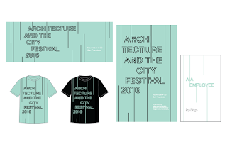
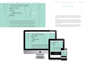
These last images are my final project designs, making a brochure, poster, banner, a website, and applications for AIA's Architecture and the City Festival. The challenge I had was trying to figure out some design with typography with such a long title. After doing some research on this festival, and looking up some pictures of buildings, I was inspired by the Eiffel Tower. The fact that it is a structure, the simple lines and the outlines of the letters displays a nonbuilding structure. Lastly, we were also to create an animation for the text, which I was pretty stoked about.